Sublime Online: L.L. Bean Catalogs
In this house we worship the boot
In the last week, I’ve started sentences with the phrase “when I was in Maine…” so many times that my roommate Jade has started to respond with faux-confusion every time I mention the state. Sorry, where were you again? Lest you think my Maine-themed histrionics were limited to my last newsletter, I assure you I’m driving everyone nuts in real life, too.
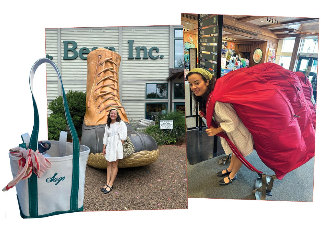
All that being said… when I was on vacation recently in an unnamed region of New England, we took a day trip to the town of Freeport, which Chris called “Disneyland for preppy people.” It’s anchored by the multi-building L.L. Bean flagship store (they literally call it a campus and it is open 24 hours a day), where you can take a picture with a giant Bean boot, buy a gun at the hunting outpost, catch an outdoor concert on the lawn, or spend $200 on a branded Scrabble and Monopoly set. I opted for a new Boat and Tote with green accents, picked out a mini red one for Jade, and got both monogrammed with their “thin script” font option.
Even on the west coast, I grew up with Boat and Tote bags in my house, although my parents just called them “L.L. Bean bags.” They were fixtures of my childhood, packed full for soccer games, weekend hikes, and picnics. The totes are made of stiff canvas, thick and sturdy, and are reinforced on the bottom and straps with an accent color (navy blue, in my house, but now in an array of hues). They’ve become trendy in recent years, but for the most part, they seem like mundane objects. Functional, sensible, unfussy.
In my opinion, my favorite kind of clothes (and accessories) are like this —kind of forgettable. The best items of clothing last long enough that you’re not wondering if they can make it through one last wash, and are comfortable enough that you’re never thinking about them chafing your thighs or squeezing your midsection or riding up your ass. L.L. Bean specializes in this kind of utilitarian, long-lasting comfort and hardiness, and the design of their catalogs follows suit: neat columns of type, clear product photos of each SKU, no-frills art direction. Like their clothes, their catalogs are nothing trendy, groundbreaking, or mind-blowing.
But upon closer look, there’s also a kind of comforting beauty there — a sure-footed, classic serif, an archive of beautifully-illustrated watercolor covers, and, always without fail, a celebration of Maine and its many seasonal landscapes (and lighthouses). I wish the catalogs were not so overwhelmingly white,1 and I wish that Linda Bean didn’t give $60,000 to Donald Trump that one time, but I’m also okay with appreciating these pieces of ephemera for what they are: solid, workaday graphic design. E-commerce may have overtaken the catalog as a sales tool a long time ago, but they still exist. They’ve been there chugging along in the background all these years, and I find them charming.
For this edition of Sublime Online, my newsletter where I go on an Internet deep dive based on something I saw IRL, I’m sharing some favorite scans I found on eBay and elsewhere from the heyday of these catalogs. Plus, I’m including some other goodies I discovered along the way. Enjoy!
Covers through the years
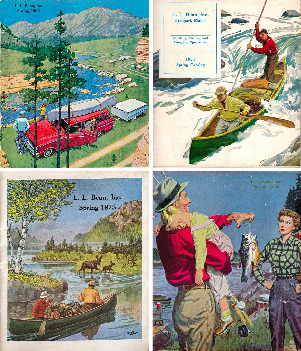
Early Bean catalogs had painted covers depicting various outdoor activities: kayaking, fishing, hunting. Unlike the utilitarian interior product shots, the covers were less about the clothes and more about the Maine outdoors lifestyle. The painted details are exquisite — the folds in the fabric, the ripples across a lake, the greenest greens of pine trees and shadowed grass — and the juicy colors are accentuated by the softness of the printing process. The Spring 1956 cover (bottom right) is considered iconic and was recreated in 2012 along with several others.
Remember opening the mailbox in December and seeing Christmas catalogs stuffed to the brim? The L.L. Bean Christmas editions may not have been the flashiest next to some of their toy-oriented or more sophisticated peers, but they were certainly the most festive. The 1989 and 1991 catalogs continue on with painterly landscapes, and remind me of Jan Brett’s picture books about wintry woodland creatures. Christmas 1994 (bottom left) seems to be an auxiliary supplement to the regular seasonal catalog. The type here is a great example of the way the brand uses Cheltenham in a variety of styles. And the Winter Values 1991 catalog incorporates a collage of framed images that, again, focus primarily on the lifestyle and landscape as opposed to any specific item of clothing. This one feels very influenced by REI and other outdoor competitors.
Practical and versatile for everyday wear

Onto the interior! As discussed, Bean catalogs took a utilitarian approach to showing off their wares. As time went on, more editorial imagery was introduced, like in the anorak spreads above (any child of the ‘90s will find this art direction familiar!). My primary takeaway here is how the type — always Cheltenham, in a variety of weights — seems to follow typographic rules usually seen in magazines or books, particularly with the tabbed indent of each paragraph’s first line.
Ads for ads
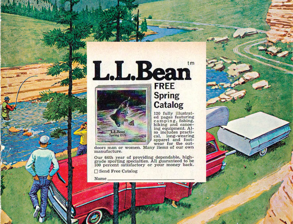
One of my favorite discoveries while rooting around for cover and interior scans was realizing that L.L. Bean also ran print ads for the catalogs. The 1993 “L.L. Bean Discoveries” magazine ad shows how just how many catalogs they released each season, and I think the art direction on the Christmas 1991 All Wrapped Up ad is genius, with the tabbed post-it notes. It demonstrates an understanding of how their customers interacted with their printed materials, and underscores their ability to be known and appreciated as a brand rather than showcasing a particular style or product. That said, earlier newspaper ads often did showcase a single item, usually alongside the catalog itself. The halftone image of the carefully folded Chamois Cloth Shirt recalls an old-fashioned general store counter to me. I also love the handdrawn script logo there and wish they continued to use it on occasion!
Three layers of turtlenecks, more layers of irony
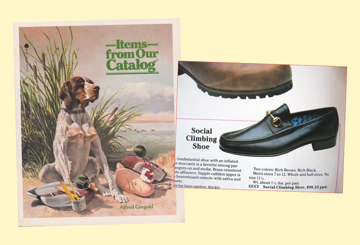
Another discovery: in the 1980s, humor writer Alfred Gingold released a book parodying L.L. Bean called Items from Our Catalog. The painted cover does recall the hunting-focused covers of the ‘30s, until you realize the dog is wearing a bra. Inside, you can find a variety of tongue-in-cheek products, such as the Social Climbing Shoe, a Fidgeter’s Skirt, and a Gum Shoe made from “pre-softened chewing gum.” Published in 1982, Items from Our Catalog seems to have capitalized on the success of 1980’s satirical WASP guide The Official Preppy Handbook (which Ali LaBelle just wrote about in her newsletter!).
A final treasure, as a treat for you
In trying to find an Internet repository of L.L. Bean catalogs,2 or more broadly, a comprehensive online archive of retail catalogs in general,3 I stumbled upon the Outdoor Recreation Archive, a collaborative project between the Utah State University’s Outdoor Product Design & Dev program (!!!) and the USU libraries. Its collections are not fully digitized, but they have an incredible Instagram as well as a Pinterest account. Have fun perusing!
Thanks for reading, as always. A hint for next week’s topic: 🍦🍦🍦. Grab a cone and keep your eyes peeled for me. 🆗
If anyone wants to help me start a commune for hot Asians in Maine, let me know.
The closest thing I could find was this special collection at the University of Maine, but it’s not digitized. Maybe one day I will make a pilgrimage and view them IRL!
Does this exist? It should!!


Sublime Online is so much fun! Love the way you pay attention to things 😌
I have no doubt these painted illustrations and vintage advertising would absolutely HIT if released as marketing now. Nostalgia is why everyone's drooling over Vacation, but L.L. Bean has so much brand awareness already I have no doubt it would translate quickly to conversion (same advice to J. Crew)