Hello from what appears to be the last gasps of summer! This morning, it was a brisk 59 degrees in New York, and my autumn-loving partner jumped the gun and started listening to The Great Pumpkin Walz a full 30 days before the season officially starts. The good news, depending on who you ask, is that it’s likely to get warmer again — which I’m pleased about, because 1) I need to go to the beach at least one more time, and 2) I’ve had this newsletter about ice cream sitting in my drafts for the last ten days, and I want to set it free before we’ve all moved on to spicier, warmer treats.
The graphic history of ice cream is wide and deep. A quick jaunt on eBay or a dip into the Internet Archive demonstrates that ice cream — as a frozen dessert, a concept, and a graphic object — has always been fertile ground for some truly Perfect Design.1
My hypothesis: an ice cream cone is the perfect signifier. There are sometimes no words necessary, just a shell-like swirl of soft-serve or a semi-circular scoop of hard ice cream balanced atop a waffled triangle or trapezoid. Even ice cream that doesn’t follow the platonic aesthetic ideal of a cone (such as banana splits, sundaes in glass dishes, sliceable cartons of Neapolitan) still has a graphic unity about it. Whether you’re driving by a Dairy Queen billboard at 60mph, searching for a cold treat in a foreign country, or pressing your nose up against the glass at your childhood scoop shop, ice cream is a universal language.
With that, I won’t wax poetic any longer! Just see for yourself, below.
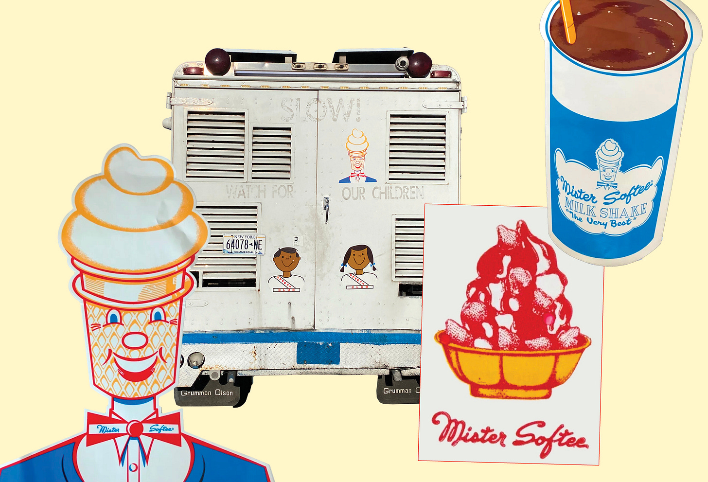
If I didn’t include New York’s most beloved cultural institution here, I fear that Mister Softee himself would come to my apartment and shoot me in the face like a foot soldier in a Martin Scorcese film.2 My fear of the cone-headed man aside, Mister Softee’s brand illustrations really are something to behold: the sticky-sweet handdrawn strawberry sundae; the loopy, lilting script of the logo, which looks like it was squirted out of a chocolate syrup bottle; the sweet Safety Club kids with their cowlick and pigtails. It’s as comforting and familiar to any New Yorker as a neon psychic sign or Helvetica on the subway.
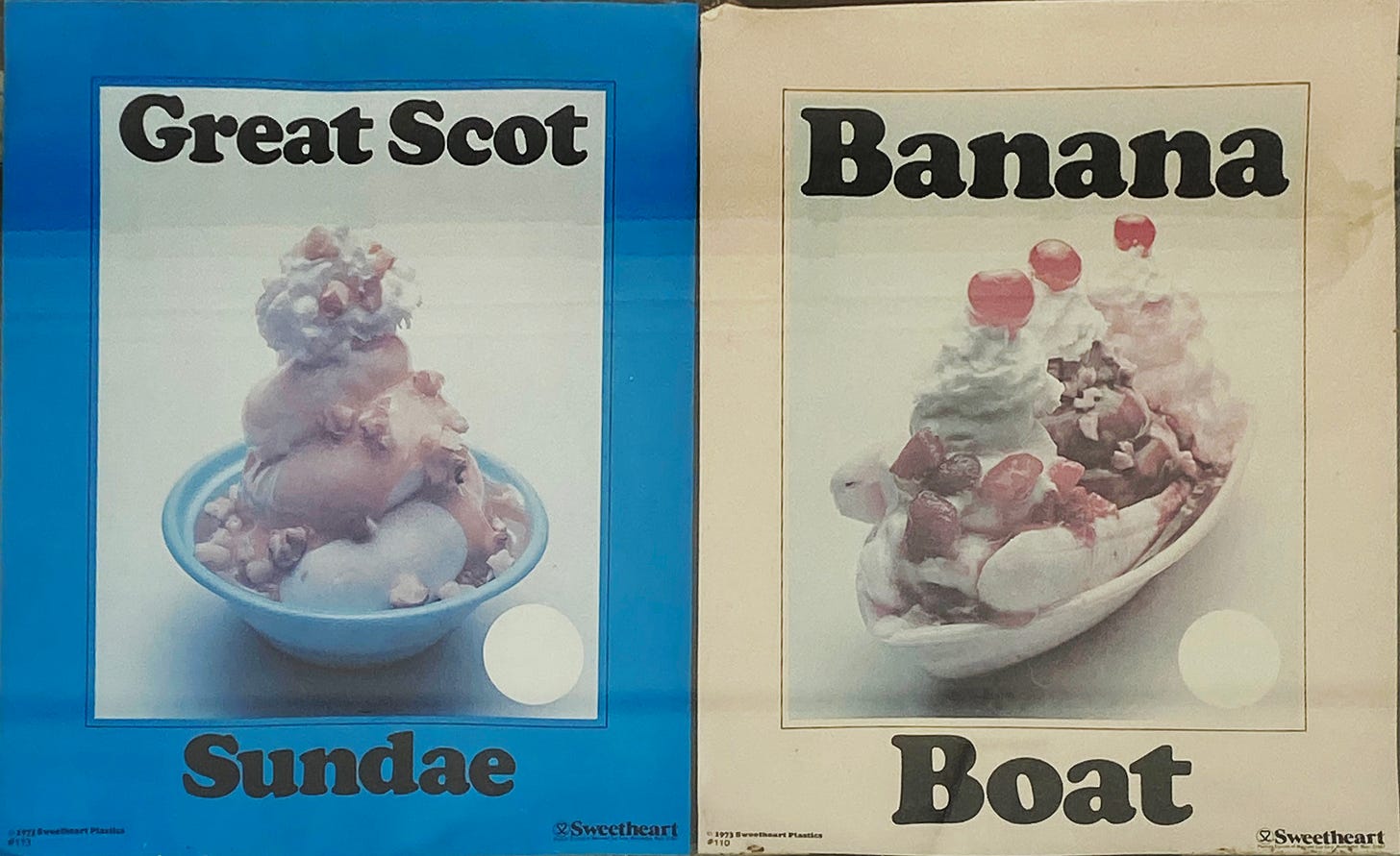
I took this picture during a 20 mile bike ride on the Cape Cod Rail Trail, when we stopped off for a cone about halfway through. Afterward, I was a bit bummed when I saw how terrible these photos came out, with the reflection and the desaturated colors. But then I remembered! I write a newsletter about graphic design in the wild, and these faded posters are perfect examples of how design becomes a product of its environment. For decades, they’ve been stuck to this west-facing window on Route 6, being blasted with sun and doing exactly what they were meant to do: sell ice cream!
I wanted to learn more about the company that made these, expecting an old school ice cream distributor called Sweetheart. But when I zoomed in close, the copyright is for 1973 Sweetheart Plastics. They made paper and plastic cups in the 20th century, and were bought by Solo in 2004 — but they did, indeed, start out as an ice cream business before diversifying into disposable plateware. However, they had given up ice cream long before 1973,3 which makes me think that these sundaes were pushed by the company to make ice cream shops sell more products in disposable bowls. There’s no plastic money to be made in edible cones!
A note on the type — Cooper Black and ice cream go together perfectly. There’s something about the typeface’s round serifs and chunky heft that are reminiscent of a perfectly round scoop of ice cream, or the fluorescent red orb of a maraschino cherry.
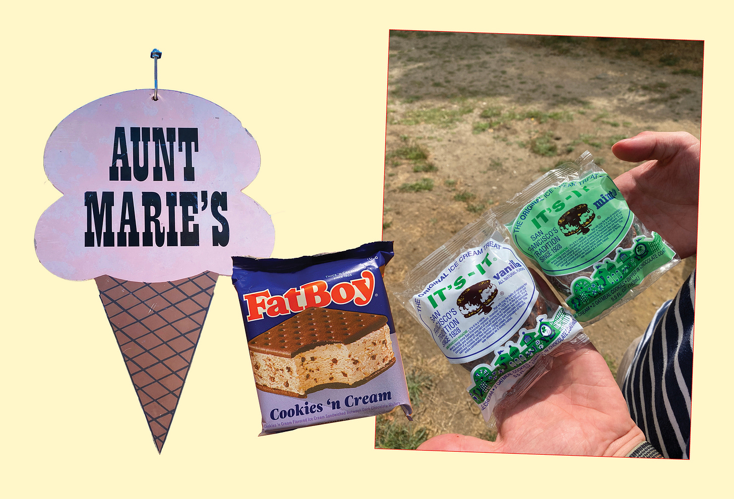
Aunt Marie’s, a curbside scoop shop in Maine, understood the simplicity of the cone and scoop, reducing it to pure shape and color. FatBoy opted for a decadent product photo, colorblocking, and chunky red type as thick as the ice cream sandwich itself. And while I could take or leave the cityscape at the bottom of the It’s-It (a San Francisco delicacy that Chris and I enjoyed in the middle of nowhere in Marin County), I am a big fan of the drippy chocolate-cookie illustration in the center.
Onto the cones! Again, the perfect signifier for a roadside stand, sure to catch the eye of drivers and backseat passengers alike. I particularly love the neon details on the Sandy’s sign and would really like to see it lit up at night.
More cones. Do you see what I mean? Very little else needs to be said when you have a perfect swirl of vanilla to work with.
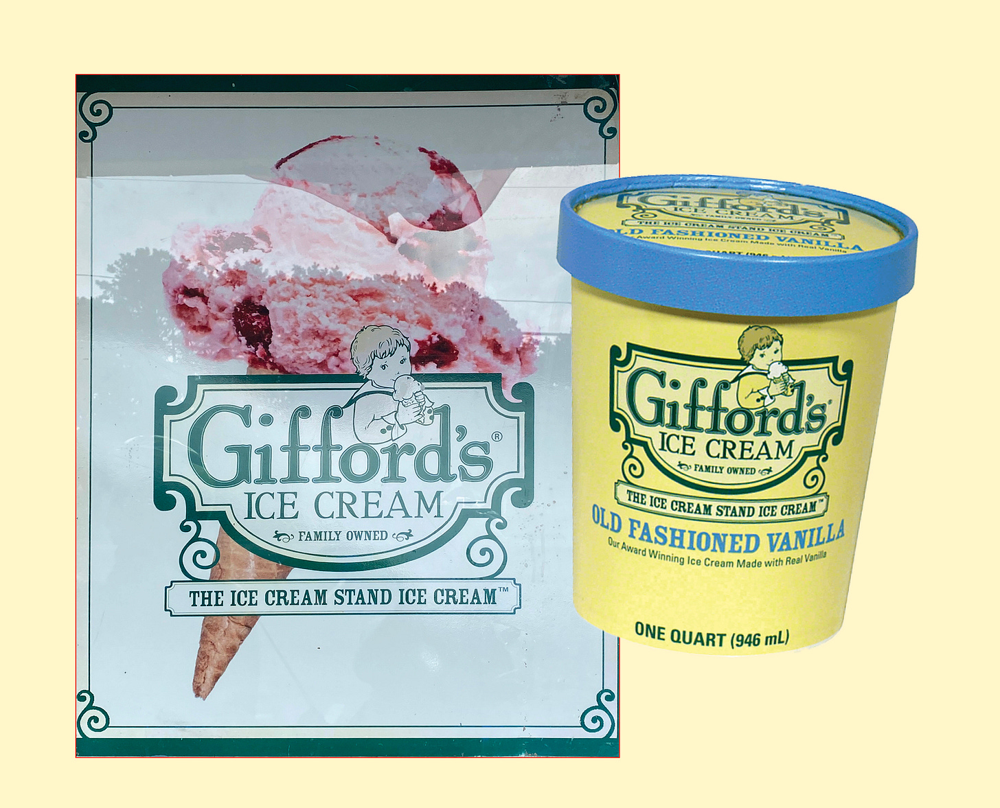
This Gifford’s sign is another casualty of the crazy reflections on Route 6, but I wanted to share it alongside a pint of vanilla that I had to pull from the internet, because the Maine-based ice cream company recently rebranded. I’m unclear why you would mess with perfection: a palette of buttery yellow, cornflower blue, forest green; a tiny genderless child in a sailor suit eating a cone; an iconic use of serifs, frames, and borders. What we are left with is this monstrosity. They massacred my boy!
Let’s step away from cones and scoops and celebrate the humble popsicle. Fudgsicles, if I recall my childhood correctly, always looked better than they tasted. Not chocolatey enough! That said, I am not sure if my mom was looking for the “red sicle ball”; we might have had poor imitations. In any case, this one is appetizing — the sharp right angles of the treat, the wood grain on the popsicle stick, the delicate fingers tugging on the lasso… The chunky letterforms of the word “Fudgsicle” feel fudgy themselves — creamy and decadent, like thick-cut slabs of spumoni. It’s enough to make me go buy a box and see if my childhood assessment was incorrect.
Some newsletters I’ve discovered lately:
Inconspicuous Consumption by Paul Lukas, who has an eye for strange detail and an obsession with noticing the world around him (right up my alley!)
A Book Designer’s Notebook by Nathaniel Roy — as an aspiring book designer myself, I love seeing Nathaniel’s inspirations and processes
Domestic Interiors by Alison Brimley, who I found via her sister Sydney Graham (whose sewing patterns I love!!) and whose newsletter is full of lovely insights and beautiful outfit inspiration
I am currently working on a really exciting branding project that will premiere at the Bryant Park Holiday Market this fall! I’m also booking work for September onward and would love to work on more print projects. Email hello@suzemyers.com if you have anything you’d like to work on together!
Thanks for reading! I have a few more New England-y things to share with you in the coming weeks, and then I promise I will move on to other topics. Ok? Ok. 🆗
So much so that I’m currently curating a special Sublime Online edition about ice cream in my brain, as I write this.
My favorite line from the Sweetheart Wikipedia page: “1947: Company executives vote, 14-to-1, against entering the cup business. But [company owner] Joseph Shapiro votes yes - and the cup business is born.”


GASPED at the redesigned Gifford’s logo
BANGER