


Eyeing in H-Mart
Corn snack, an illustrated pigeon, and the color pink in the vinegar aisle

A few weekends ago, Chris and I drove up to the newish H-Mart in Queens to check it out. It’s gigantic — exponentially larger than the one in K-Town, even bigger than the one in Yonkers. Size-wise, it’s more akin to a suburban Super Target, replete with a just-opened food court, a fishmonger, a bakery, and a whole-pig butchery demonstration that my poor vegetarian boyfriend accidentally witnessed on the way to the bathroom.
As to be expected, and as with most Asian grocery stores, H-Mart’s aisles were bursting to the seams full of Perfect Designs — inventive and innovative Korean CPG, of course, but also Japanese, Chinese, and Thai imports. It was hard not to stop every few feet to take a photo of a box of crackers with a mascot, or a bottle shape that America haven’t seemed to figure out yet. This made me feel like an aspiring influencer (gross feeling), which is the opposite of the Perfect Design Noticer that I actually want to be (warm fuzzy feeling). I don’t want to visit a place just to search for tidbits for this newsletter! I could just use Pinterest or Are.na or google dot com for that.
One of the reasons I think my brain went into overdrive in H-Mart is because I’m rarely in a space of this scale that carries objects that feel novel to me. A walk through Target reveals Barilla pasta, Lactaid milk, eggs from wherever. Some of it is perfectly designed, and some of it is new, but most of it I’ve seen my entire life. It’s hard to notice. So even though I grew up in a half-Asian household and am no stranger to Chinese cooking wine or seaweed-wrapped rice crackers, the sheer abundance of the cavernous Queens H-Mart and all of its resplendent imported packaged goods has the capacity to knock me off my feet. I want to make sure that I’m noticing things in a non-fetishistic way, taking it in for what it truly is and not what I assume it could be. Everything is perfect there! But if everything is perfect, then nothing is.
Or maybe I’m overthinking it, and everything really is perfect and I should move into H-Mart like the kids who move into the Met in The Mixed Up Files of Mrs. Basil E. Frankweiler. I could take pictures of anything that catches my eye and make TikTok videos that go viral in midwestern cities that don’t have Korean-American supermarkets. Until I decide to do that, please enjoy the following jpegs.

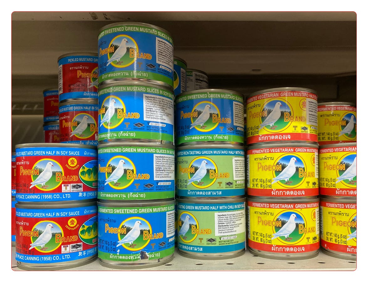
These are little cans of fermented mustard greens. I always appreciate an illustrated logo, and I like how the pigeon illustration somehow looks cohesive in every colorway.
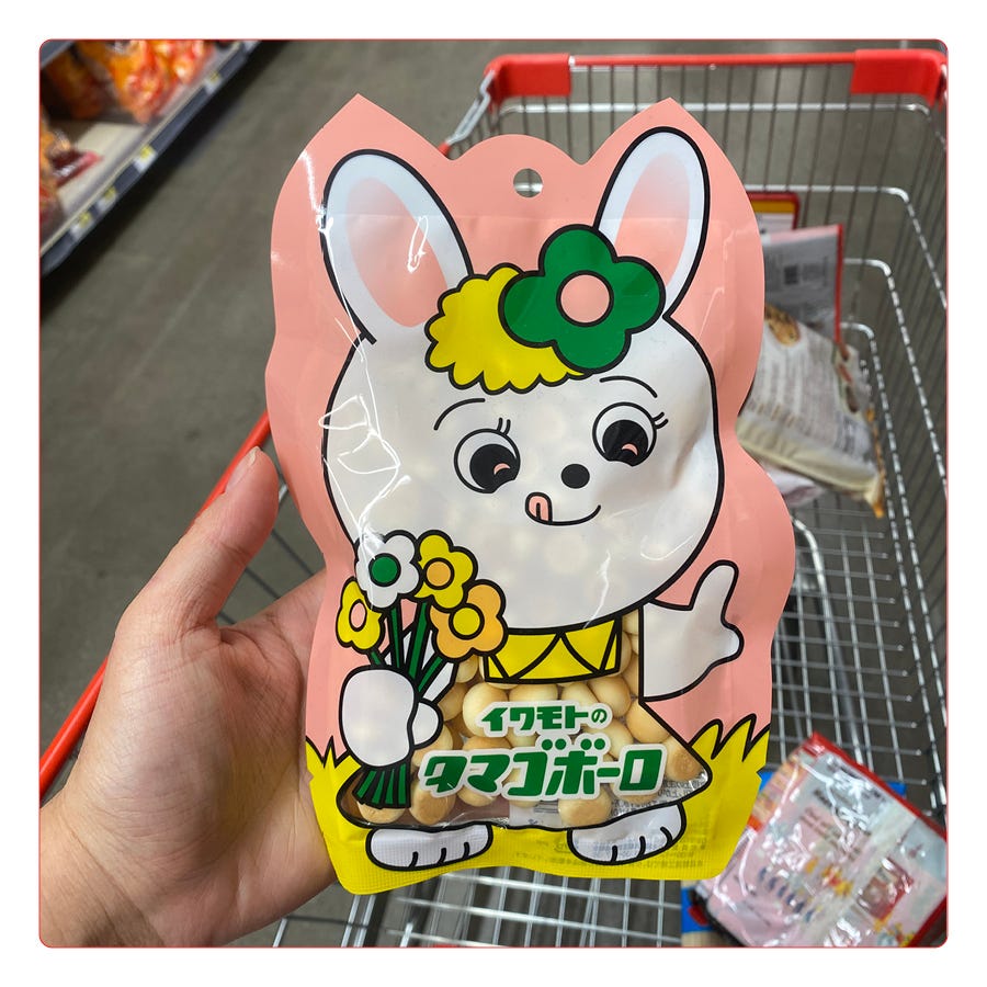
I have tried these kind of puffy wheat snacks before and they taste like Nothing, which means 1) they must entirely rely on the cute packaging to sell, and/or 2) they are for small children.
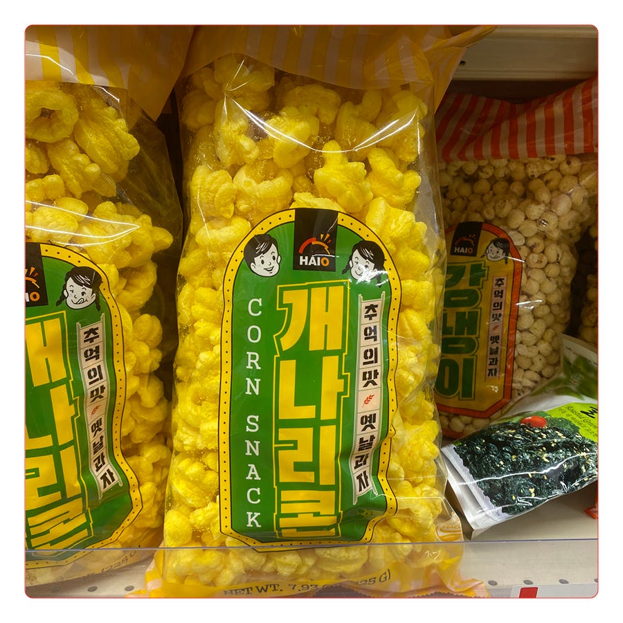
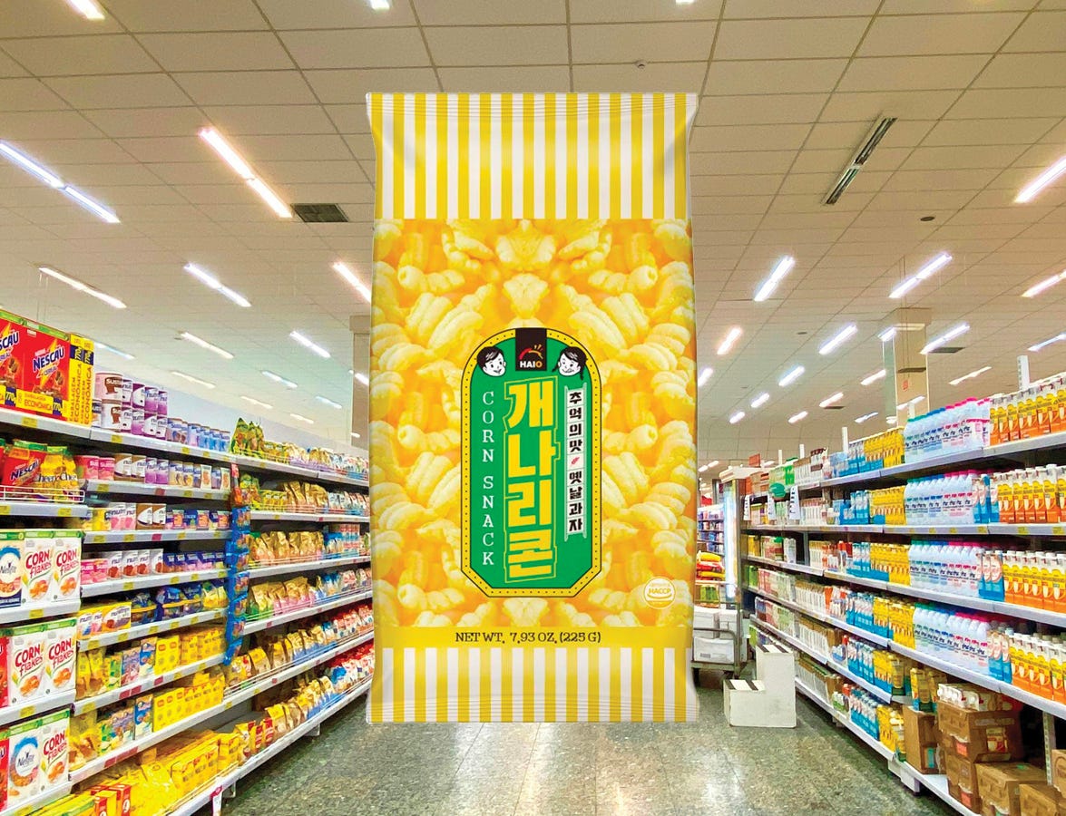
Corn snack! The little boy and girl faces look like slightly older versions of Peko and Poko, the Milky candy mascots, just less cartoonish. Really digging the colors here (a commitment to yellow!) and the vertical marquee layout of the text.
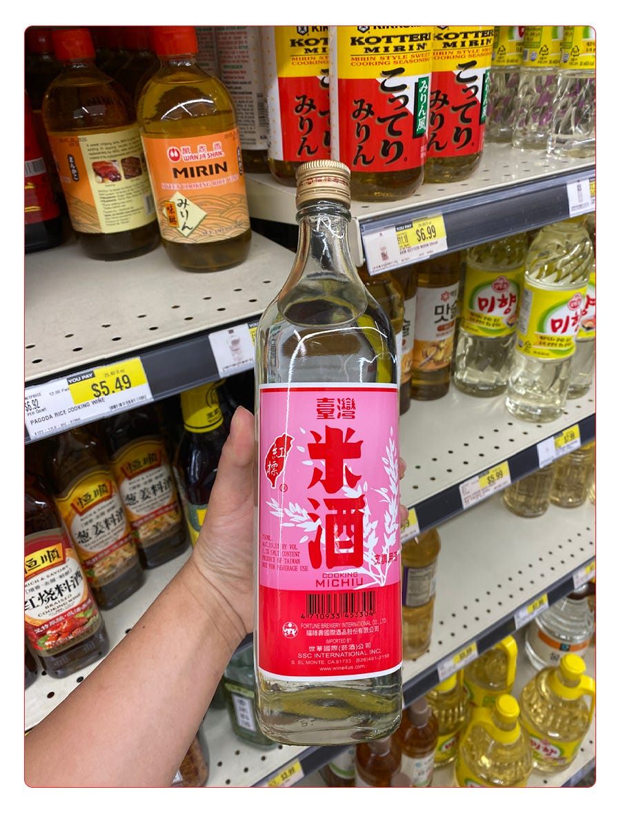
Someone (maybe me?) needs to do a historical, archival dive into the label design of Chinese / Korean / Japanese vinegars and cooking wines, of which there are hundreds at a store like H-Mart and probably thousands overall. This bottle of michiu, a Chinese rice wine, stood out from a sea of yellow and green labels. The pink and red is unexpected, and, dare I say… sexy?
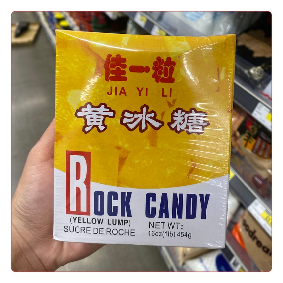
Rock candy (yellow lump). This box is a workhorse, doing exactly what it came to do: hold rock candy and tell us what’s inside, and nothing more. Digging the primary color scheme, that big ass “R,” and the distinction between the roundness of the red Chinese characters on top and the “handdrawn,” rough edges of the characters just below them. I looked Jia Yi Li up, and apparently this candy and its packaging is very nostalgic for those who grew up with it — I can see why.
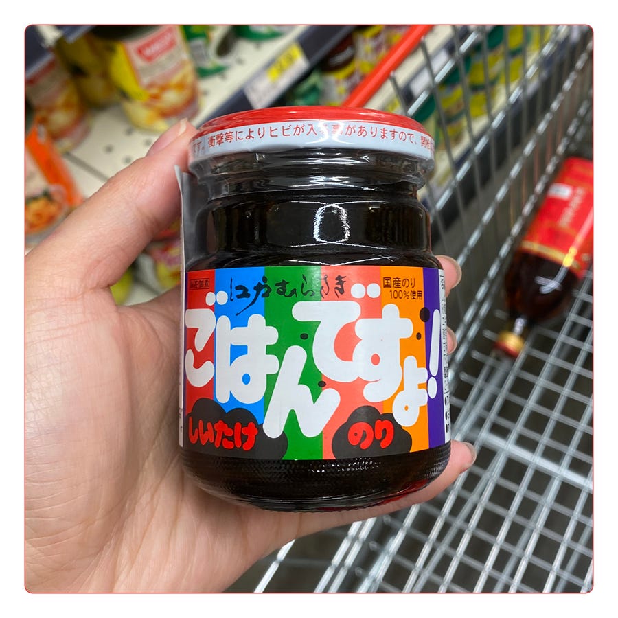
This is a Japanese shiitake-mushroom paste made to go on rice. I love the almost-rainbow stripes and the super round, bubbly ends of the characters. There’s something about this that feels in congruence with the current CPG trend in American grocery stores: playful, colorful, and appealing to a millennial audience that needs all the little things to be aesthetically pleasing because we will never be able to afford property. It’s been recently redesigned, but the original packaging was just as cute. I don’t know enough about Japanese groceries to figure out where this fits into a larger market — it’s very possible that this is just a common after school snack meant to appeal to kids. If anyone knows, let me know!
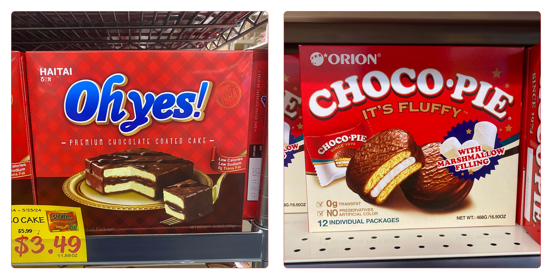
Who wore it best?! From a sample size of two, plus the memory of several other unphotographed boxes surrounding these ones, it seems like packaged snack cakes follow a branding formula: red as the primary color; thick, bold type; product photography that makes it look like god herself blessed this union of flour and chocolate. I am obsessed with the way the cut slice of Ohyes! cake impossibly floats upon its fork, glistening. It can’t be that good, but this packaging could convince me.

I have work availability in late June / early July, if anyone wants a new fun logo or website (or know someone who does!).
Last night we went to Birds of a Feather and stopped by the Swedish candy store Bon Bon afterward, which was full of perfect design and is, of course, absurdly expensive.
Retiring my long shirts I usually wear to bed, because I’ve discovered the joy of a cotton nightgown that makes you feel like Jo March.
Counting down the days before I get to go to Maine for two weeks!!
Thanks for reading! CPG is on my noggin these days for work reasons, but hopefully I will be back soon with some less food focused design. I think about more than hot dogs and corn chips, I promise. 🆗
We as a society don't use the word replete enough